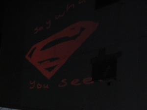
These are two icons which I might use for my I-Phone App button, using software I found a great website called: flavor studios

Wednesday 23 December 2009
Tuesday 8 December 2009
Information Architects
This poster by Information Architects is absolutely amazing. Consisting of information graphics about the web and want is going on in the World Wide Web.


Monday 7 December 2009
Peter Grundy Inspiration
My latest project (design issues), will be loosely based on the theme (does technology (specifically the computer) hinder creativity). Now the sole aim is to communicate how important other medium contribute to the creative process e.g. sketching, brainstorming, doodling etc and I want to create a sort of illustrative world around a ladder which is leading up to the creative goal or haven with out the use of the computer, I want to produce this as a large scale poster, with characters mad up of the utensils designers would use to produce there work with out a computer. I have been trying to source a designer to whom does illustration in a Visual Narrative sense. I came across an Illustrator named Peter Grundy (http://www.grundini.com/) who is of great inspiration for me if I am to proceed with this idea. He combines info graphics/illustration/art and humor to sum up some hot topics and including design issues which exist today.
Sunday 6 December 2009
New Posters for Billy Mawhinney
The following are 2 posters which will be printed to form 1 A3 folded poster for a university project. These are just prototypes for an initial mark up but still need more thought?
Saturday 5 December 2009
Interesting Sequence By Aiga Voice 2
Interesting Sequence By Aiga Voice 2, maybe inspiration for Issue Project 2009
http://voiceconference.aiga.org/voice_bl.swf
Steff Geissbuhler changes his Voice in this hillarious presentation from the 20/20 show
(Flash 5, 3MB).
http://voiceconference.aiga.org/voice_bl.swf
Steff Geissbuhler changes his Voice in this hillarious presentation from the 20/20 show
(Flash 5, 3MB).
My Photography Essay

Unknown: Image 2
These images represent the theme of which I have used for the basis of my photography essay, the essay's details are to produce a minute long quick-time movie consisting of a theme chosen by the student. My theme is Alleyways and how they are perceived. An essential task as a photographer is to get to understand your subject matter for enable you to photograph it have an effective communication.
Design Issue
The most recent project I have been given in University is based on the subject of what design issues exist in the world of Design (Product/Graphic/Website/Photography) etc. Such issues as Design Entrepreneurship, Sustainability, Ethics, Corporatism and Technology all dominate current Forums and Discussion within Design.
My aim is to pick one of these issue's and research then build a visual narrative based on what surfaces from the initial research and Idea development. Now I personally have been having problems trying to decide what route to go down, whether I just skim the top of the iceberg with an issue or to go really specific with a subject which closely relates to anything I'm finding troublesome in my practice, for example Idea development and creativity is a universal issue I feel but can technology contribute to this block/barrier/hindrance etc. This is one angle I might come in from. Another issue that's universal (effects us all) is Sustainability in the sense that everyone needs to address this immediately.
I am a week into this project and I continue to procrastinate and dwell and Ideas that might!!! be a good idea!!! Why! do I do this, is it just me? or is that a design issue in itself?
But the idea I have reached is one which I feel I can build into a successful Visual Narrative/Sequence etc to explain the issue of Technology in the context of Creativity and Idea development. The main consensus is how much do we depend on the computer for our ideas to take shape/how it should be used not only as a tool but as an extension of ourselves, similar to an extra limb or something which is not solely dedicated to idea development as an extra luxury.
The next stage after idea development (still to do :-{) is to propose;
Propose |prəˈpōz|
verb
1 [ trans. ] put forward (an idea or plan) for consideration or discussion by others : he proposed a new nine-point peace plan | [with infinitive ] we propose to be away for six months | [with clause ] I proposed that the government should retain a 51 percent stake in the company.
an idea to show how the information/designs/visuals etc would be applied to a vehicle/application etc for public use.
Now this is the tricky part for me. How do I take an issue like Technology which I stated earlier and construct that into a Visual narrative e.g. a storyboard/sequence/comic/animation, using any technique–illustration/photography /animation or video to tell the story of one of the themes.
The result could be a proposal for a booklet, leaflet, I-Phone App, poster, website, pdf, animation or film.
Now my inclination is to just to do a series of posters or a leaflet to show this design issue (technology-computers-creativity) in full flow but I'm not getting an spark to ignite an idea of how!!!
But I think I have cracked it! I asked myself the question what do I find most difficult sometimes when it comes to idea development, in fact initial ideas! What I usually do is go straight to the the computer or books for inspiration which is OK but can start a course of course of creativity which could be bland or even boring when your not thinking originally, so I would brainstorm and mind-map and (from these start to sketch) instead to spur on the design process of original thought and in synergy with the computer and books these ideas can take form and generate into fully fledged projects, this subject of idea building (information graphics) is the issue I am trying to address and use for the inspiration for this project. The very thing that I am writing about this and working on this type of issue on the computer is in itself ironic and this is where I might get the idea for the branding of the project.
IRONIC/IRONY could be a logo in the use of the letter I to represent the word etc.
So now I am thinking about a vehicle for how whatever the Visual Narrative i design will be applied for, Not leading on from the comment I made earlier about how it is Ironic that I am doing this design issue on the computer, I thought an I-Phone App would be a really conceptual way of carrying this information/visual awareness through to the mass, somewhere they kind find information and visual narrative on how the computer can act as a hindrance to creativity.
These two images represent how I want to apply this idea as a logo and as a vehicle for my visual narrative to go into. My branding will be labeled/named (I) which stands for Ironic.
The information or visuals that I generate for the initial research and idea development will be inspired by Information graphics and character inspiration. Work from Nicholas Felton maybe my catalyst for my work and maybe a bit of E-boy thrown in their to help but images below might help me!!!
The information or visuals that I generate for the initial research and idea development will be inspired by Information graphics and character inspiration. Work from Nicholas Felton maybe my catalyst for my work and maybe a bit of E-boy thrown in their to help but images below might help me!!!


Friday 4 December 2009
Interesting Questions To Ask Myself!!!
DO I HAVE TOO WEAR GLASSES TO BE A DESIGNER?
WILL I BECOME BALD IF I THINK TO MUCH?
WHEN WILL I GROW UP? (HOPE I DON'T)
HOW LONG UNTIL I LAND MY DREAM JOB?
How will I get a Placement?
This is the task put in front of me for the next couple of months before the end of my second semester. The placement I think I will absolutely need if I'm going to stand any chance of getting my foot in through the door of the creative world.
I sometimes doubt whether I will be able to survive after I finish my degree and try to proceed through my career, but I feel that this is the process of learning and will require living a bit. I often think the little things in life are often the most important things, which are missed out by the average person. So the question at hand of what I really want to do next year (between my 2nd yr and final yr) I could take the option of continuing into final year and try to (I think) take a risk relying solely on my work and experience's to be successful, another choice is to do a study year in Europe or the U.S using such schemes as ERASMUS or ISEP this I think could as beneficial as going on a work placement, for it supplies great material for my C.V and adds a to my experiences in life already which would stand me in good steed for my future.
But my main tasks now are to continue to chip away at the mountain to gain forward motion in my future which will require me to create portfolio's, a C.V, placement documents and a thick skin.
Monday 9 November 2009
Nicholas Felton
Nicholas Felton: Information Designer
About: IS 31 YEARS OLD and LIVES IN NEW YORK CITY.
Link 1 Feltron.com
Link 2 The Office of Feltron
Nicholas Felton a graphic designer I have been researching for my most recent project, I have been drawn in by the amazing pieces of Information Design work. His use of space, color and text are just beautifully put together on the printed page.
His creative pieces are inspiration by every day occurrences such as transport rides, sport, computer games and media. He uses these to accumulate data so he can form large scale posters about his experiences.
I love the way the images are constructed and I have been inspired by some of his work for my current project which I will use data obtained from an interview which has a bit to much data to process, so in order for the information to be legible and fun to integrate with I want to turn it into the creative driving force for the Publication.
Here are a few example of work that Nicholas Feltron has produced for his annual reports ranging from the year 2005 to 2008.
The Feltron Annual Report 2005

Friday 23 October 2009
Billy Mawhinney
This is the name of the interesting subject Me and my group (Jonathan Fleck and Stephen McCartney) have been given to study, photograph, write and fully design an article on.
His website is as follows: www.billymawhinney.com
This man has pretty much done it all in the world of Advertising, working as creative director for world famous companies mainly Leo Burnett Ltd and JWT and creating advertising campaigns for such prestigious brands as Levi, Audi, Jaguar, Rover, Kit Kat, Liberty's, Ford, Barnardo’s and the Independent.
His main role in his career which has spanned for just over 30 years has been in the creative directors role in the companies he has worked for. He has won numerous awards such as the Irish Film Festival Gold, D&AD pencils, Computer Animation Awards, British Television and IRL Radio Gold, Rank Cinema awards, three Film and TV Festival of New York awards, two Cannes Silver awards among many others.
His main drive is in T.V Advertising, but has also done a lot of print and graphic design work for his clients such as Smarties, Kit Kat and Asda.


The Design pieces above I thick are brilliant, with a really smart sense of humor which crosses over from his work in Advertising. This work for Smarties encapsulates the thoughtfulness for the audience that these directed at. The first two I got after a wee bit of thought which I thought was really fun, but I have to admit the third was the trickiest.
From researching this man I feel he is really interesting person in general, but from what I have learn't so far is his devotion to his work ethos, he likes a familiar surrounding, enjoys time with his family, enjoys change and is considered the Nicest guy in Advertising. The info I have about him might not be accurate, I need to do more research, but being from the same country as him and going to the University that he went to the University of Ulster I feel it might help in the communication element. Plus he is a Man United fan so that should stand me in good stead.
His website is as follows: www.billymawhinney.com
This man has pretty much done it all in the world of Advertising, working as creative director for world famous companies mainly Leo Burnett Ltd and JWT and creating advertising campaigns for such prestigious brands as Levi, Audi, Jaguar, Rover, Kit Kat, Liberty's, Ford, Barnardo’s and the Independent.
His main role in his career which has spanned for just over 30 years has been in the creative directors role in the companies he has worked for. He has won numerous awards such as the Irish Film Festival Gold, D&AD pencils, Computer Animation Awards, British Television and IRL Radio Gold, Rank Cinema awards, three Film and TV Festival of New York awards, two Cannes Silver awards among many others.
His main drive is in T.V Advertising, but has also done a lot of print and graphic design work for his clients such as Smarties, Kit Kat and Asda.


The Design pieces above I thick are brilliant, with a really smart sense of humor which crosses over from his work in Advertising. This work for Smarties encapsulates the thoughtfulness for the audience that these directed at. The first two I got after a wee bit of thought which I thought was really fun, but I have to admit the third was the trickiest.
From researching this man I feel he is really interesting person in general, but from what I have learn't so far is his devotion to his work ethos, he likes a familiar surrounding, enjoys time with his family, enjoys change and is considered the Nicest guy in Advertising. The info I have about him might not be accurate, I need to do more research, but being from the same country as him and going to the University that he went to the University of Ulster I feel it might help in the communication element. Plus he is a Man United fan so that should stand me in good stead.
Mario Eskenazi. Diseno Grafico
The following company is an interesting company
(www.m-eskenazi.com) from Barcelona, Spain. I first came across them in a book called:
Graphics Explained: 7 Top Designers, 7 Briefs, 49 Solutions...
In Their Own Words
 I really like the use of simplicity and color within there designs, They don't over load the pages with information and communicate directly with legible type and interesting imagery.
Unlike many less gifted designers of his generation elsewhere in Europe, Mario Eskenazi has resisted the lure of expanding his workshop into a bigger business. One of a group of internationally renowned designers who were born in Argentina but practiced in Spain and developed his company to have a reputation of simple, surprising, ideas based design solutions.
In 2000, Eskenazi was awarded Spain's National Design Prize. He has been a member of the AGI (Alliance Graphique Internationale) since 1997.
(www.m-eskenazi.com) from Barcelona, Spain. I first came across them in a book called:
Graphics Explained: 7 Top Designers, 7 Briefs, 49 Solutions...
In Their Own Words
 I really like the use of simplicity and color within there designs, They don't over load the pages with information and communicate directly with legible type and interesting imagery.
Unlike many less gifted designers of his generation elsewhere in Europe, Mario Eskenazi has resisted the lure of expanding his workshop into a bigger business. One of a group of internationally renowned designers who were born in Argentina but practiced in Spain and developed his company to have a reputation of simple, surprising, ideas based design solutions.
Saturday 26 September 2009
SEA Design
Research: Looking at design group called SEA Design
This Design company is one of many brilliant examples of how Identity/Branding can be applied to many sources. This firm have produced material for such protegious clientele as BBC, John Rocha, Boots, EMI, GF Smith, Virgin plus many other great organizations.
There website contains all the relevant information about their work, plus has 3 PDF downloads of a selection of their work they have produced for many companies.
They demonstrate well with the use of their photography how they apply there work, with clear demonstration and the location and Justifying what was the aim behind there work. Here a few images of the work they have produced for paper company GF Smith


Belfast Culture Festival (Paperjam Design)
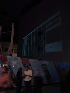
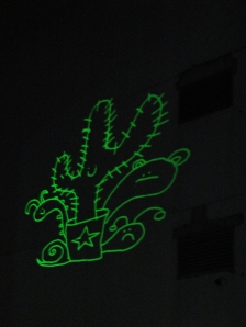
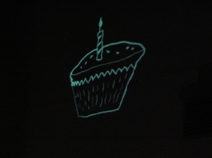
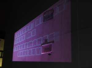
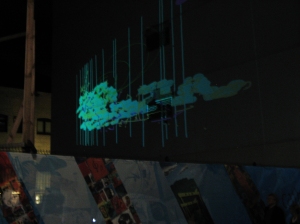
Last night 25/9/09 I visited this quite rare event happening in the Cathedral Quarter of the Belfast around my University (University Of Ulster) called Culture Night Belfast. The main aspect of the festival I particularly wanted to see was a projected design which was hosted by the Design Company called Paperjam, The aim by these graphic designers! was to do certain types of artistic and stylized drawings using a projector on the side of a building adjacent to there HQ.
They illustrations where being drawn using the tools in Adobe Illustrator and Adobe Photoshop, but consisted of tedious drawings of characters or objects of one certain color. After reading the Culture Festival Brochure it said that this company were one of the leading practitioners within N.Ireland of Motion Graphics, so I presumed sum kind of Live Graphics. But was a wee bit! disappointed when this drawing that they were doing carried on for the whole hour and a half that they were projected to do. But I was impressed (not) by the way they used the brush tool and made a drawing of a cupcake seem like a lifetime to complete.
Here are a few Photograph's of the site,
Graphics Explained (Brand Identity Research)
There is a book called,
Graphics Explained: 7 Top Designers, 7 Briefs, 49 Solutions... In Their Own Words
This book strongly represents and demonstrates the world of clients and the relationships that evolve between the designer and client, and how they manage working in these environments. It also show's the direction followed and how each specific company developed the brief they had been given.
It takes you through each groups process and show's you the different applications and methods that each company applied to there brand identity's. I think this book would be very beneficial to anyone wanting to gain insight into the working environment/the creative process used by pro's.
Friday 11 September 2009
FARROW Design Company
"Make things look better"
These words are quoted from Mark Farrow, founder of the company FARROW, This self taught designer has established himself if the design world elite with clients such as the BBC, Atlantic Records, Channel 5, EMI Records, MTV and many other companies.
He describes his work as follows, "it doesn't matter which we are working on, be it a 12-inch sleeve for Kylie Minogue, a gallery for the Science Museum or a global labeling system for Levi's the aesthetic is the same and the approach identical.
I'm drawn to his way of experimental identification that surrounds his work and the power behind some of his concepts, his bold use of color also sets him apart from others in the sense of play and interpretation.
Friday 4 September 2009
Iconic Photography
Iconic Photographers and there Photographs Joe Rosenthal
Man = Joe Rosenthal http://en.wikipedia.org/wiki/Joe_Rosenthal
This simple but striking photograph of a group of American Marines hoisting a flag of the United States is one example how a photograph can change lives on a massive scale.
This snapshot shows strength, patriotism, glory and most of all hope. For during the time of this Photograph was taken the second world war was in its gloomiest days, this photograph was featured in a truly epic movie I watched and directed by Clint Eastwood called Flags of our Fathers. The picture is a national icon and symbolizes so much more than just a victory on top of the island of Mount Suribachi.
It relates to such images of families, men united, country, struggle and overall all victory. This photo also has some controversy around it since the moment the picture was captured. The flag was actually the second flag that was raised on the day of battle, the occasion took place ninety minutes before but those watching considered the flag to small. Luckily for Joe Rosenthal he was present the second time round and captured this image, which won him a Pulitzer Prize and has since appeared on stamps and posters everywhere.
Tuesday 1 September 2009
Intro Design Company
"Style through process and development" words quoted from a publication in the book Contemporary Graphic Design by Charlotte and Peter Fiell, Intro Design company was Co-founded by Katy Richardson and Adrian Shaughnessy in London England. They deal mainly with the Design/ Direction/ Production running of a design company, They have an extremely productive output, with work being made for such clientele as the BBC, British Council, FIFA, EMI Group, Oasis, The Prodigy and many other successful clients.


Monday 31 August 2009
Good Talk (TED) by Sir Ken Robinson
This video for me personally has hit on a thoughts I've been having these past couple of years, Coincidence dently enough ever since I left school, I feel it is very important for me and others in the same stage as me in education, to be alert and open to the facts of life and how education (Past and Present) are the foundations of our life's work, This talk from www.ted.com (http://www.ted.com/talks/ken_robinson_says_schools_kill_creativity.html) by Sir Ken Robinson makes an entertaining and profoundly moving case for creating an education system that nurtures (rather than undermines) creativity.
Thursday 27 August 2009
Last years Pixel Portrait project
When looking through the work that I have produced whilst in first year of the Viscom degree course, I have decided to try and critique the work produced and see what I have gained from the experienced.
One of the most quirky projects was a week long assignment based on creating an image using pixels. You were able to use any media (non computer based) and had to have a spec of 32 x 32 pixels.
I opted to use small colored sticker, which when used with a grid I manipulated and was able to form an image related to my main aspects of face e.g. eyebrows, hair, nose, eyes and lips, are all distinguishable from one another, inspiration came from early Nintendo video games such as Super Mario and Tetris.


Subscribe to:
Posts (Atom)


